hibob.com is an HR management SaaS platform for fast-growing companies. It serves multiple personas and complex organisational structures.
I collaborated with the brand team to develop the motion guidelines for their new branding launch. The process included researching, testing, prototyping a website, and a toolkit to guide its implementation.
Graphic elements
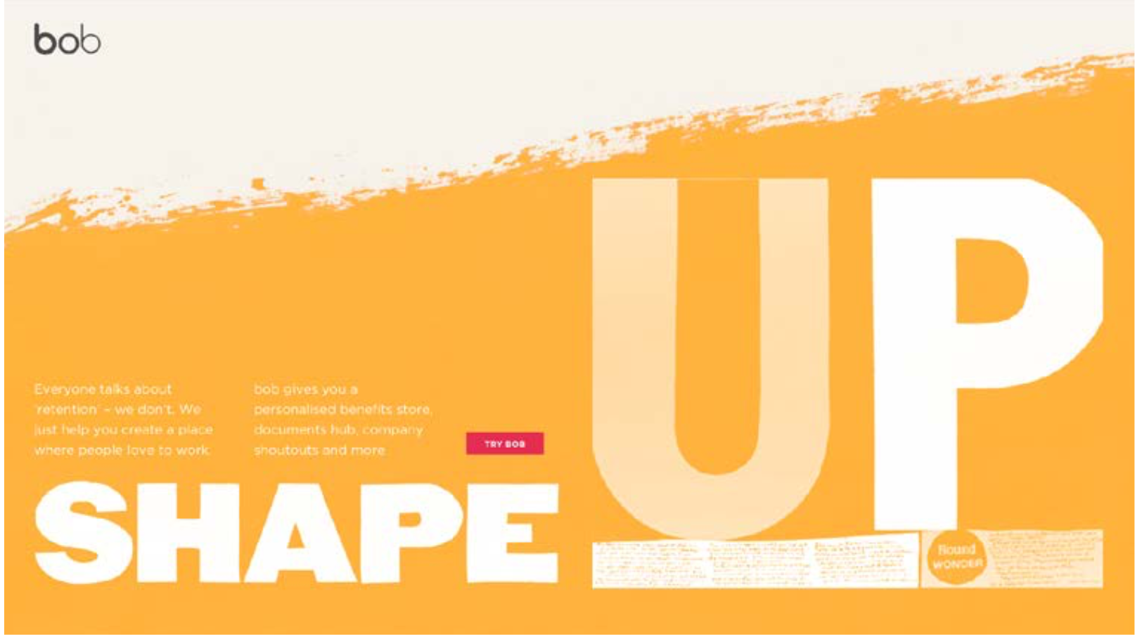
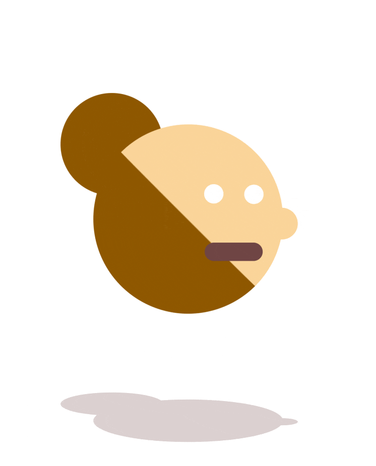
The overall design language is derived from the organic world style of paper cutouts and paper tearing in line with the brand values. These organic shapes became the building blocks of the visual world.
"We believe it's the personal, handmade touches that engage people and unlock business success. So we show more soul than most technology companies might. We combine warmth with sharp insights. We have the confidence to be refreshingly honest. To make bold statements. Our realness helps us connect on a personal, human level."
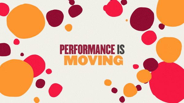
SOCIAL
Two short animations for social media with a CTA - inviting new users to the landing page, hinting at the look and feel of what's to come after clicking.
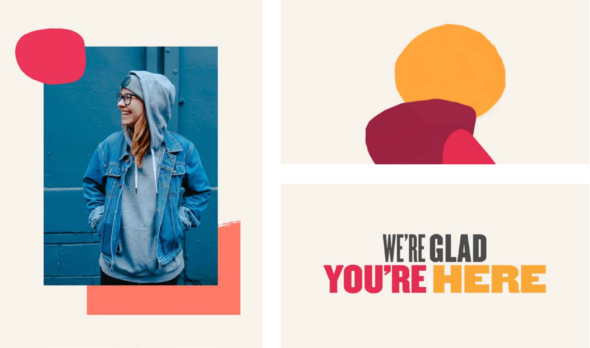
Minisite
As part of the collaboration, I teamed with Hi Bob's creative team to design an interactive minisite launching the new 'bob TALENT' feature, giving an immersive dive into the realm of the brand.
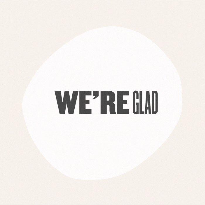
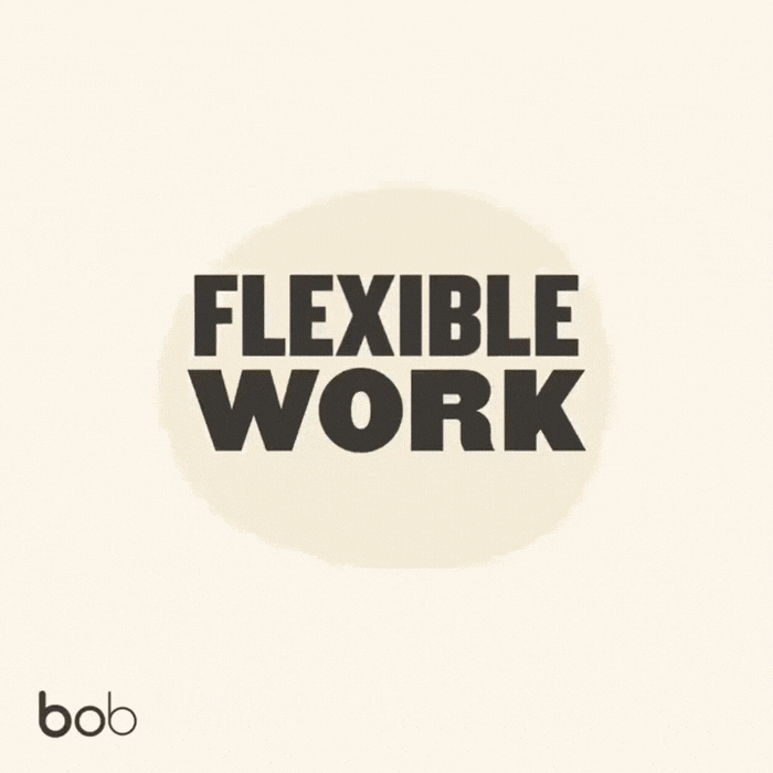
TYPOGRAPHY TREATMENT
The new branding uses variable font widths, used simultaneously to represent the flexibility of the service and to emphasise the way it can change and adapt to fit different needs.